

Key Candlestick Patterns Every Trader Should Know
Master 35 key candlestick patterns to spot market trends and reversals easily 📈. Download the free PDF guide to enhance your trading skills with clear, practical tips.
Edited By
James Carter
Candlestick charts have become a staple tool for traders and investors around the world, especially in the Indian market, for analysing price movements with clarity and precision. Unlike simple line charts, candlestick charts offer a visual story of how prices have moved within a specific time frame, showing opening, closing, high, and low prices together. This compact visual helps spot market sentiment quickly.
Understanding candlestick patterns is key to making well-informed market decisions. These patterns reflect shifts in supply and demand caused by trader behaviour and can hint at potential price reversals or continuations. For example, a 'Doji' pattern, where the opening and closing prices are almost the same, often signals market indecision and possible change in trend.

This guide organises all the essential candlestick patterns in one easy-to-read chart, categorising them by their typical trading signals — bullish, bearish, or neutral. For Indian traders particularly, this practical framework aids in decoding price actions faster, whether in stocks listed on NSE or BSE, or cryptocurrencies traded on local platforms.
You will find patterns ranging from simple single candlesticks like 'Hammer' and 'Shooting Star' to complex multiple-candle formations such as 'Morning Star' and 'Three Black Crows'. Each pattern is explained not just with its shape but also with its implications on market psychology.
Remember, no pattern guarantees a market move but instead increases the odds when combined with volume, trend analysis, and other technical indicators used regularly in Indian trading practices.
Familiarising yourself with these patterns strengthens your ability to enter or exit trades strategically, manage risk better, and avoid emotional decisions triggered by market noise. Over the course of this article, you’ll gain a clear understanding of how to recognise and apply candlestick patterns effectively, helping you improve your trading success rates in volatile markets.
By keeping all these critical patterns in one chart, this guide serves as a handy reference whether you are checking charts on your mobile stock trading app or desktop setup at your brokerage.
Let’s start by breaking down what exactly a candlestick represents and how you can read it before moving on to patterns that often signal market movements.
Grasping the basics of candlestick charts is essential for any trader or investor aiming to decode market behaviour effectively. Candlestick charts pack a lot of information into simple visual shapes, making complex price movements easier to interpret. This section breaks down the key components of these charts, helping you recognise patterns that signal shifts in market sentiment or potential price action.
Each candlestick consists mainly of a body and two wicks (also called shadows). The body represents the opening and closing prices within a particular time frame—the thicker the body, the bigger the price change. If the closing price sits above the opening price, the body is usually hollow or coloured green to show upward movement; if below, it’s typically filled or red to indicate a fall.
The wicks extend from both ends of the body and mark the highest and lowest prices attained during that period. For example, a candlestick with a long upper wick suggests sellers pushed prices down after a high spike, indicating potential resistance.
Candlesticks capture the battle between buyers and sellers over specific time frames, offering a snapshot of momentum. A long green body means buyers dominated, pushing prices higher, while a long red body signals sellers’ control.
Small-bodied candles with long wicks, like Dojis, reveal indecision—neither side having clear control. Traders spot these as possible signals for trend reversal or consolidation. For instance, after a steady rise in Reliance Industries shares, spotting a Doji candle may hint that the strong uptrend could pause or reverse.
In India, traders often use daily charts for longer-term views and 15-minute or hourly intervals for intraday trades. Equity markets tend to favour daily or weekly charts to assess trends, while commodities and currency traders may prefer shorter time frames to capture quick moves.
Adapting candlestick analysis according to the trading horizon is critical. For example, a bullish engulfing pattern on a weekly chart for Tata Steel might confirm a sustained uptrend, whereas the same pattern appearing on a 5-minute chart may reflect short-lived momentum bursts.
Candlestick patterns reflect the psychology of traders at work—greed, fear, hesitation, or confidence. A Bullish Engulfing pattern at a support level in NSE-listed stocks like Infosys often indicates buyers tipping the scales, possibly prompting a rally.
Meanwhile, a Shooting Star appearing near a recent high implies sellers might be ready to pull prices down. Recognising these shifts early can help traders position themselves smartly.
Understanding these visual cues about market sentiment can enhance decision-making and timing, especially in volatile markets like India’s stock exchanges.
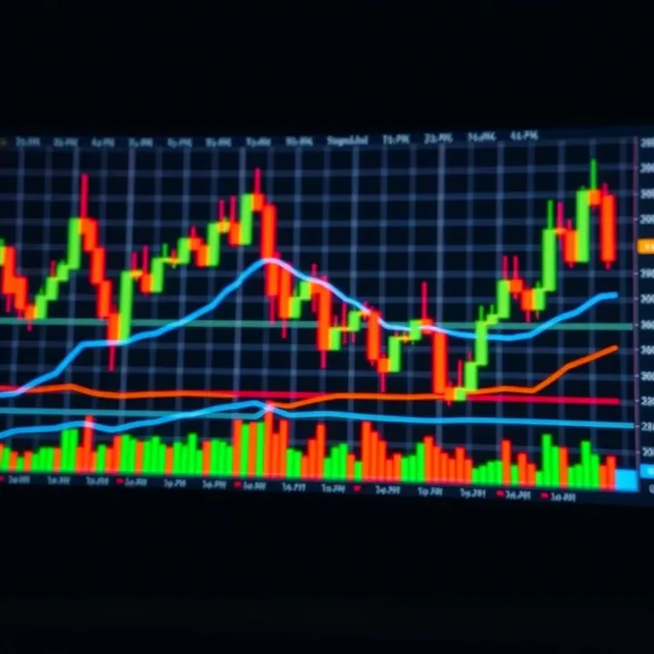
While indicators like Moving Averages or Relative Strength Index (RSI) quantify trends and momentum, candlestick patterns deliver raw insights into price action. They complement each other well. For example, if the 50-day moving average suggests an uptrend, a Morning Star pattern confirms bullish sentiment.
Unlike lagging indicators, candlestick patterns often signal reversals or continuation before other tools confirm. That said, relying solely on candlesticks or any single method can be risky. Combining candlestick analysis with volume trends or support-resistance levels offers a more robust trading edge.
In summary, understanding candlesticks and their patterns lays the groundwork for effective technical analysis. They provide a direct lens on market behaviour — invaluable for traders navigating India’s dynamic financial markets.
Bullish candlestick patterns help traders spot potential upward moves in price. These patterns signal a shift in sentiment from selling to buying. Recognising them early can be a strong advantage in timing entries and managing risk effectively. For Indian markets, where volatility can spike quickly, understanding these signals adds practical value beyond just textbook knowledge.
Hammer and Inverted Hammer: A hammer emerges after a downtrend, with a small body near the top and a long lower wick. This shape suggests buyers pushed the price up after initial selling pressure. The inverted hammer is similar but appears with a long upper wick instead. Both indicate that the bears may be losing strength. In practice, spotting a hammer at key support levels in Nifty or Bank Nifty can hint at a bounce-back, especially when volume confirms the move.
Bullish Engulfing: This pattern occurs when a small bearish candle is completely engulfed by a larger bullish candle the next day. It shows strong buying interest overpowering sellers. In Indian equity markets, a bullish engulfing formation near a moving average or a support zone often triggers follow-through buying, making it a reliable reversal sign for traders.
Morning Star: A morning star consists of three candles: a large bearish candle, a small-bodied candle (indecision), and then a large bullish candle closing well into the first candle's body. This pattern signals a strong change from downtrend to uptrend. If a stock like Reliance Industries demonstrates a morning star on its daily chart after hitting a recent low, it could be a signal for traders to consider long positions.
Rising Three Methods: This pattern is a pause in an uptrend where a large bullish candle is followed by three small bearish or indecisive candles confined within the first candle’s body, then another strong bullish candle continuing the trend. It indicates consolidation before the uptrend resumes. Traders monitoring IT sector stocks during a sustained rally might spot this pattern confirming their conviction.
Bullish Harami: The bullish harami features a large bearish candle followed by a smaller bullish candle completely inside the previous body. It suggests slowing selling pressure and the chance of an upward reversal. In volatile markets, this formation can prompt short-term traders to move from short positions to cautious buys, especially if it aligns with RSI or other momentum indicators.
Recognising these bullish patterns helps you act with the market's sentiment, improving the odds of entering profitable trades. Use them with volume and other tools for confirmation, especially in the dynamic Indian stock landscape.
Identifying major bearish candlestick patterns is vital for traders and investors aiming to protect their capital and time their exits in falling markets. These patterns often signal potential reversals or continuation of downtrends, offering early warnings to adjust positions or avoid fresh longs. Indian markets, known for sudden swings especially around earnings or policy announcements, require traders to spot these signals promptly for better decision-making.
A Shooting Star appears after an uptrend and looks like a small-bodied candle with a long upper wick. It shows buyers pushed the price higher during the session but sellers regained control by the close, signalling weakening momentum. For example, if Reliance Industries Ltd shows a Shooting Star at ₹2,500 after a steady rise, it hints at potential selling pressure ahead.
This pattern is practical for traders to spot an early reversal without waiting for confirmation from volume spikes. It works best when combined with support/resistance levels or other technical indicators, like RSI.
The Bearish Engulfing pattern occurs when a small bullish candle is followed by a larger bearish candle that completely envelopes the previous day's body. This shift reflects a strong change in sentiment from buyers to sellers, often marking the start of a downtrend.
For instance, if Tata Motors shares trade steadily but then form a Bearish Engulfing pattern near a resistance level, it suggests bears are taking charge. This helps investors exit timely or short sellers to enter, especially on shorter time frames like daily charts.
The Evening Star is a three-candle pattern signalling a top reversal. It starts with a bullish candle, followed by a small-bodied candle signalling indecision, then a bearish candle confirming the downtrend. This formation usually happens after a bull run and warns that the uptrend is losing steam.
In Nifty 50 stocks, spotting an Evening Star near all-time highs can prompt traders to tighten stop-losses or book profits. Given India’s volatile markets, this pattern helps navigate sudden shifts effectively.
This pattern shows a pause during a downtrend, with a few small bullish candles sandwiched between two long bearish candles. It suggests sellers remain in control despite short-term rallies, often leading to further declines.
For example, if the State Bank of India’s share price dips sharply, then trades in a narrow upward range before falling again, the Falling Three Methods could validate continuation of the bearish trend. This setup is useful during volatile phases when quick trend reassessments are needed.
A Bearish Harami forms when a large bearish candle is followed by a smaller candle completely inside the previous day's body. It signals hesitation among bears, often marking potential slowdowns before further falls.
In practical terms, if HDFC Bank displays a Bearish Harami after a sharp dip, it suggests indecisiveness but with bearish bias. Traders often wait for confirmation with the next candle before taking action, reducing false signals.
Recognising these major bearish candlestick patterns can significantly improve timing for exits or short entries. Combining these with volume, support/resistance, and Indian market context ensures more reliable trade setups.
Neutral and indecision patterns are vital in understanding when the market shows hesitation or a pause. Unlike clear bullish or bearish signals, these formations indicate uncertainty among traders, often forecasting possible changes ahead or a consolidation phase. For Indian traders, recognising such patterns can prevent premature decisions and help in planning more strategic entries or exits.
Doji patterns occur when the opening and closing prices are nearly equal, showing indecision between buyers and sellers. The Standard Doji signals a balance of power, often appearing at possible turning points. The Long-Legged Doji has long wicks both sides, reflecting strong price swings within a session but no clear direction. The Dragonfly Doji, with a long lower shadow and no upper shadow, suggests sellers pushed prices down but buyers regained control. In Indian markets, these patterns often occur before volatile moves, especially in stocks with active retail participation.
Spinning Tops display small bodies with longer upper and lower shadows, representing a tug of war between bulls and bears. The short body indicates little change in price by close, while the shadows show volatility. This pattern points to market indecision, often following a strong trend and suggesting possible stall or minor reversal. Traders in NSE or BSE frequently spot Spinning Tops to decide if a trend is losing steam, especially in sector-wise analysis where sentiment can turn swiftly.
Neutral patterns act as red flags for traders. When a Doji or Spinning Top appears after a strong uptrend, it hints that bullish momentum is fading. However, these patterns alone are not enough; traders usually seek confirmation from following candles or volume changes. For instance, a Dragonfly Doji followed by a bullish candle may confirm a strong support zone. Indian traders often combine this with indicators like RSI or MACD for added conviction before acting.
Indecision patterns help traders fine-tune their timing. Rather than entering at the peak of a trend, spotting a Doji at resistance levels may signal a chance to book profits or tighten stop losses. Conversely, spotting a Long-Legged Doji at a known support level can prompt cautious entry with a predefined exit. These patterns have practical value for swing traders in Indian equities or commodities, where sharp reversals affect intraday and short-term trades. Maintaining discipline through such cues reduces risks tied to impulsive moves.
Reading neutral and indecision candlestick patterns offers a window into market psychology. They signal moments when the market is weighing options, making these patterns invaluable in strategising your trades effectively.
An all-in-one candlestick pattern chart acts as a quick reference tool, especially useful for traders and investors who want to identify market signals without flipping through multiple sources. It condenses essential candlestick formations with corresponding interpretations, making decision-making more efficient. For example, when scanning the Nifty 50 or commodity charts like gold futures, having a single visual sheet helps spot key reversal or continuation patterns immediately.
Grouping patterns by type and signal helps in organising patterns so that traders can quickly associate them with market trends. Reversal patterns such as the Hammer or Shooting Star can be clustered together, while continuation patterns like Rising Three Methods are arranged separately. This categorisation prevents confusion, allowing you to focus on the most relevant signals amid market noise. Grouping also aids in faster memory retention; when you repeatedly see similar patterns side-by-side, recognising them on actual charts becomes easier.
Choosing colour codes for quick recognition further enhances chart usability. For example, bullish patterns could be highlighted in green shades, bearish patterns in red, and neutral or indecision patterns like Doji in grey or blue. This colour differentiation allows you to glance at the chart and immediately understand the potential market direction without getting caught up in text details. In fast-moving Indian markets, such as the intraday craze on Bank Nifty or volatile commodity segments like crude oil, colour cues save valuable seconds.
Adapting patterns for different market segments like equities and commodities is crucial because these segments behave differently. For instance, candlestick patterns in volatile commodities such as turmeric or cotton futures might need more confirmation signals compared to large-cap equities like Reliance Industries or TCS. Your all-in-one chart can include tailored notes or colour-coded warnings indicating where a particular pattern tends to be more reliable or risky. This helps in avoiding false signals especially during events like monsoon season disruptions that heavily affect commodity prices.
Using patterns with Indian indicators for effective analysis ensures that candlestick reading fits seamlessly into the broader technical toolkit popular in India. When combined with local favourites such as the Relative Strength Index (RSI), Moving Average Convergence Divergence (MACD), or volumes from NSE and BSE, candlestick patterns gain better context. For example, a Bullish Engulfing pattern confirmed by rising volumes on NSE stocks strengthens the buy signal. Integrating these data points into your chart strategy improves decision accuracy, particularly when trading during volatile phases like budget announcements or RBI policy weeks.
A well-crafted all-in-one candlestick chart isn't just a picture—it’s a practical guide that saves traders from paralysis by analysis while fitting perfectly into the complex Indian market landscape.
Master 35 key candlestick patterns to spot market trends and reversals easily 📈. Download the free PDF guide to enhance your trading skills with clear, practical tips.

📈 Master Indian stock trading by understanding key candlestick patterns to read market trends, predict price moves & boost your strategy effectively.

📈 Explore all essential candlestick patterns with clear explanations and practical tips for traders. Download the handy PDF to keep expert insights at your fingertips!

📈 Discover the most profitable candlestick patterns for traders in India. Learn how to spot key setups in stocks and commodities to boost your trading success.
Based on 8 reviews